

The Influence of Color Psychology in Creating Stunning Images
Introduction
Color psychology explores how colors influence human emotions and perceptions. In photography, it serves as a powerful tool to enhance visual storytelling.
- Understanding color: Different hues can evoke specific feelings, making them essential in crafting stunning images.
- Key takeaway: By mastering color psychology, you can significantly elevate the emotional impact and aesthetic appeal of your photographs.
What You Will Learn
This article delves into various aspects of color psychology, including:
- Key elements of color (hue, value, saturation)
- Emotional responses elicited by different colors
- Cultural interpretations of color
- Practical techniques for effective color use in photography
Engaging with these concepts will empower you to create visually captivating works that resonate deeply with your audience.
In the realm of photography, understanding how to leverage color psychology can be particularly beneficial. This knowledge is especially useful when exploring genres such as boudoir or erotic photography. These styles often challenge societal norms and perceptions, much like the journey towards destigmatizing sex work which is crucial for fostering a more inclusive society.
Moreover, mastering color psychology can help in creating a luxurious boudoir experience, where each photograph becomes an empowering showcase of uniqueness and confidence. Such experiences are not merely about taking pictures; they are about immersing oneself in a realm where luxury meets creativity, and self-expression is celebrated with every click of the camera.
As you delve deeper into this subject, remember that it also involves understanding the cultural interpretations of color and how these can influence the emotional responses elicited by different shades. This knowledge will not only enhance your photographic skills but also enable you to connect more deeply with your audience.
Understanding Color Psychology
Color is a powerful tool in photography, heavily influencing viewer perception and emotional reactions. Three key elements define color: hue, value, and saturation.
The Three Elements of Color
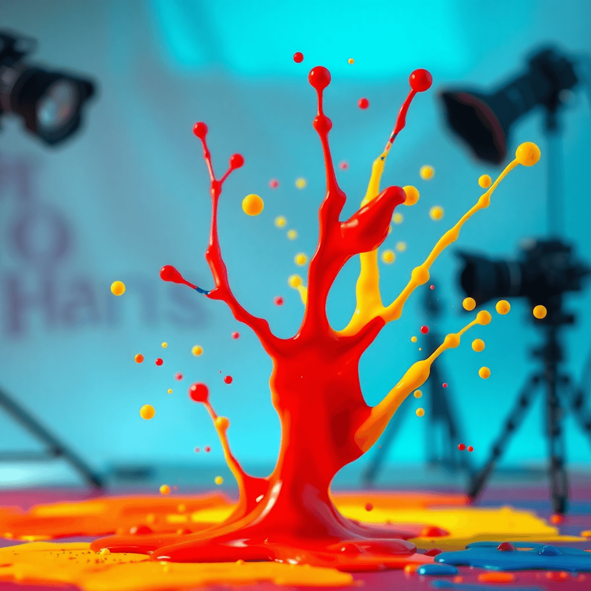
- Hue refers to the specific color itself—red, blue, green, etc. Each hue conveys different feelings. For example, red can evoke passion or urgency, while blue often represents calmness or serenity.
- Value pertains to the lightness or darkness of a color. A high value (light colors) can create an airy feel, suggesting openness or softness. In contrast, low-value colors (darker shades) may introduce a sense of drama or depth.
- Saturation describes the intensity of a color. Highly saturated colors appear vibrant and energetic, capturing attention instantly. Less saturated colors tend to be more muted and can evoke feelings of nostalgia or subtlety.
Understanding how these elements interact is crucial for photographers aiming to elicit specific emotional responses from their audience. For instance:
- Warm colors like oranges and yellows can stimulate excitement and positivity.
- Cool colors such as greens and blues often promote relaxation and tranquility.
Photographers must carefully consider these emotional implications when composing their images. The choice of color not only impacts aesthetics but also serves as a narrative device, conveying messages that enrich storytelling through visuals.
In specialized photography genres like boudoir, understanding color psychology becomes even more essential. Boudoir photography aims to empower individuals by capturing their intimacy and self-confidence, which can be significantly influenced by the color choices made during the shoot.
For instance, warm tones might enhance feelings of passion and intimacy in couples boudoir photography, while cooler tones could evoke a sense of calmness and connection between partners.
Color can highlight themes within photographs, guiding viewers’ emotional journeys. A well-chosen palette can transform a simple image into an evocative piece that resonates deeply with its audience. In this way, mastering color psychology equips photographers with the tools necessary to create stunning images that leave lasting impressions.
The Emotional Spectrum of Colors
Colors play a significant role in evoking emotional reactions. Understanding the psychological effects of both warm and cool colors can enhance your photography.
Warm Colors
Warm colors, such as red, orange, and yellow, tend to create feelings of excitement, energy, and passion. These colors can stimulate emotions and draw attention. Here are some characteristics:
- Red: Often associated with love and intensity, red can evoke strong feelings of desire or urgency.
- Orange: This color radiates warmth and enthusiasm, often used to create a friendly atmosphere.
- Yellow: Bright and cheerful, yellow can invoke happiness but may also be overwhelming if overused.
Strategically incorporating warm colors into your images can energize the viewer's experience.
Cool Colors
Cool colors like blue, green, and purple offer a different emotional spectrum. They tend to have calming or soothing effects on viewers. Key points include:
- Blue: Often linked to tranquility and stability, blue can evoke feelings of peace. It is widely used in landscapes or serene portraits.
- Green: Associated with nature and growth, green promotes a sense of harmony and balance.
- Purple: This color combines the stability of blue with the energy of red, creating an air of creativity and luxury.
Photographers can utilize these cool tones to generate a more relaxed atmosphere in their work.
Practical Application
To effectively evoke desired emotional reactions in your audience:
- Consider your subject matter when choosing warm or cool colors.
- Experiment with color saturation for added impact; more vivid hues can amplify emotions.
- Use color contrast strategically to direct focus within the image.
These techniques will help you connect with your viewers on a deeper emotional level through your photographs. Understanding the emotional spectrum allows you to tell compelling stories using color.
However, it's crucial to remember that the journey of self-discovery in photography isn't always smooth. Many professionals grapple with imposter syndrome, which can stem from constant comparison in their field. This mindset not only undermines self-confidence but also hinders creative expression.
In the pursuit of authenticity in photography, especially in niche areas like boudoir or erotic photography, embracing one's unique style becomes essential. A queer-friendly boudoir studio serves as a perfect example of how such spaces foster self-expression and empowerment. Here, individuals are celebrated for their true selves, allowing for genuine representation through the lens.
Cultural Context in Color Perception
Color meanings are deeply influenced by cultural symbolism, shaping how individuals and communities interpret colors. Understanding these variations is crucial for photographers aiming to create impactful images.
How Different Cultures Interpret Colors
- Red: In Western cultures, red often symbolizes love and passion. Contrastingly, in some Asian cultures, it represents good fortune and joy.
- White: While commonly associated with purity in many Western societies, it signifies mourning in countries like China and India.
Case Studies
- India: The color saffron is sacred, representing sacrifice and spirituality, integral to religious ceremonies.
- Japan: Pink embodies the transient beauty of cherry blossoms, evoking feelings of renewal and hope.
Photographers should consider these cultural nuances when choosing colors for their work. Misinterpretation can lead to unintended messages that detract from the intended emotional impact. By being aware of color meanings across cultures, you can enhance storytelling through your photography, ensuring that images resonate authentically with diverse audiences.
The Importance of Consent in Spicy Photography
In the realm of spicy photography, understanding consent is paramount. This adds another layer of complexity to color perception as it intertwines with personal boundaries and comfort levels, particularly when working with intimate themes such as those found in boudoir photography.
The Role of Confidence in Boudoir Photography
The confidence that comes from understanding one's own body and how different colors can accentuate its features plays a significant role in the success of such photographic endeavors. For instance, the choice of lingerie color can transform an image's emotional resonance.
Sensitivity Towards Unique Experiences
Moreover, photographers should also be sensitive to the unique experiences of their subjects. For example, a luxurious divorce boudoir session is not just about capturing moments; it's a journey of self-discovery and empowerment. Understanding the cultural context behind color choices can significantly enhance this experience.
Embracing Diversity in Photography
Finally, embracing diversity in body types and gender identities is crucial in today's world. The concept of Inclusive Boudoir Photography for SWs celebrates this diversity while also acknowledging the cultural significance of colors used in such settings.
Techniques for Effective Color Use in Photography
Incorporating color effectively can transform your photographic compositions. Here are practical tips to enhance visual impact:
1. Using Bold Colors
- Use bold colors to create striking focal points. Bright hues like red, yellow, and magenta capture attention and evoke strong emotions.
- Experiment with backgrounds that either contrast with or complement these bold shades, allowing subjects to stand out prominently.
2. Incorporating Pastel Colors
- Soft, pastel colors provide a gentle aesthetic. Shades such as mint green, baby blue, and soft pink evoke feelings of calmness and serenity.
- Consider using pastel palettes in portraits or serene landscapes to create a dreamy atmosphere.
3. Understanding Complementary Color Schemes
Understanding complementary color schemes enhances balance in your images. Complementary colors sit opposite each other on the color wheel.
- For example:
- Pairing blue with orange or red with green creates vibrant contrasts that energize the composition.
- This technique not only draws the viewer's eye but also adds depth and interest to your photographs.
Implementing these strategies allows you to leverage the emotional power of color to enhance storytelling in your work. By experimenting with bold and pastel colors alongside complementary schemes, you can achieve harmony and visual intrigue that resonates deeply with your audience.
Moreover, photography serves as a powerful form of visual advocacy, especially for marginalized communities such as the LGBTQIA+ community. Understanding the importance of accepting LGBTQIA+ photography can further enrich your understanding of how color and composition can celebrate love, diversity, and individuality. Additionally, embracing these techniques can significantly boost confidence in your photography skills, allowing you to express yourself more freely and authentically through your work.
Color Psychology in Branding and Marketing Strategies
Color choices significantly influence consumer behavior and shape perceptions regarding products and brands. Understanding this relationship is crucial for effective branding. Here are key points to consider:
1. Emotional Associations
Each color evokes specific emotions. For instance, blue often conveys trust and calmness, making it a popular choice for financial institutions. In contrast, red incites excitement and urgency, frequently utilized by fast-food chains to stimulate appetite.
2. Brand Identity
Colors help establish a strong brand identity. Companies like Coca-Cola use red to convey energy and passion, while IBM employs blue to signify professionalism and reliability. This strategic use of color creates an immediate association in the consumer's mind.
3. Differentiation from Competitors
The right color palette can set a brand apart in a crowded market. For example, T-Mobile’s magenta stands out against competitors who typically favor more muted tones in telecommunications.
4. Cultural Relevance
Different cultures interpret colors uniquely. Brands must consider cultural context when designing their visual identities to avoid misinterpretations that could alienate target audiences.
Understanding these elements allows businesses to leverage color effectively, enhancing their marketing strategies while fostering a connection with consumers. Such awareness leads not only to better brand recognition but also influences purchasing decisions on an emotional level. This understanding of color psychology in branding can further optimize branding efforts by ensuring that color choices align with brand values and resonate with target audiences.
Incorporating Color Psychology in Boudoir Photography: Enhancing Intimacy Through Colorful Imagery
Boudoir photography thrives on creating a sensual atmosphere that celebrates individuality and body positivity. The strategic use of color plays a pivotal role in achieving this goal.
**1. **Warm Colors
Shades like red, pink, and orange can evoke feelings of passion and intimacy. These colors enhance the emotional connection between the subject and viewer, making the imagery feel more inviting.
**2. **Cool Colors
Soft blues and greens can introduce a calming effect, promoting relaxation and comfort. This is essential for clients who may feel vulnerable during their sessions.
3. Body Positivity
By selecting colors that complement skin tones, photographers can empower clients to embrace their bodies. Colors should highlight natural beauty rather than overshadow it.
**4. **Mood Setting
Different color palettes can shift the mood of an image from playful to romantic. Understanding how colors influence emotions allows photographers to tailor their approach based on the desired outcome.
Incorporating these elements fosters an environment where clients feel safe, respected, and celebrated. The Influence of Color Psychology in Creating Stunning Images is particularly relevant in boudoir photography, as it enhances not only aesthetics but also emotional resonance. This understanding is part of the broader Power of Art that photographers should leverage. Additionally, employing Helpful Tips can further improve the overall experience and outcome of the shoot. Embracing the unique aspects of each client through mIsFits while providing them with a sense of Agency during the session is crucial for achieving memorable results.
Creating Stunning Images with Color Psychology: A Photographer's Guide to Leveraging Emotions Through Strategic Use of Colorful Elements
Understanding color psychology equips photographers with the ability to create images that resonate emotionally. By strategically employing color, you can enhance the visual impact of your photographs. Here are key principles to consider:
**1. **Emotional Resonance
Different colors evoke distinct feelings. For instance, reds and oranges can evoke passion and energy, while blues and greens often convey calmness and tranquility.
**2. **Color Harmony
Utilizing complementary colors can create a balanced composition that draws the viewer’s eye. Explore combinations on the color wheel to find pairings that enhance your subject matter.
3. Highlighting Features
Use contrasting colors to draw attention to specific elements in your image. This technique is particularly effective in portrait photography, where the subject’s features can be emphasized through color choices.
**4. **Symbolism
Colors carry meanings that can deepen the narrative of your work. Consider how cultural perceptions of color may influence interpretation and emotional response.
Harnessing these techniques enables you to craft visually captivating images that not only grab attention but also leave a lasting emotional impression on viewers.
Conclusion
Understanding the transformative power of color in visual storytelling is crucial for photographers.
- Color psychology directly influences viewer emotions and perceptions.
- Applying these principles enhances the emotional impact of your images.
Consider these key insights:
- Explore different colors and their psychological effects to create desired atmospheres.
- Use color strategically to convey messages and enhance narratives.
By embracing the influence of color psychology, you can elevate your photography.
Encourage experimentation with bold hues or soft pastels to achieve striking visuals. The journey into color should be personal and reflective of your artistic vision.
Take action today by integrating these concepts into your work. Capture stunning images that resonate deeply and leave a lasting impression on your audience.
This is especially relevant in fields like erotic and boudoir photography, where understanding the subject's emotions and vulnerabilities can lead to more powerful imagery. Embracing these aspects can also help in embracing imperfections, which adds depth to your work.
FAQs (Frequently Asked Questions)
What is color psychology and how does it relate to photography?
Color psychology is the study of how colors affect human emotions and perceptions. In photography, understanding color psychology helps photographers create images that evoke specific emotional responses and enhance the visual appeal of their work.
What are the key elements of color that photographers should understand?
The key elements of color include hue, value, and saturation. Hue refers to the type of color, value relates to the lightness or darkness of a color, and saturation measures the intensity or purity of a color. These elements contribute significantly to how an image is perceived.
How do warm and cool colors influence viewer emotions in photography?
Warm colors like red and orange typically evoke feelings of excitement or warmth, while cool colors such as blue and green tend to have calming effects. Photographers can strategically use these colors to elicit desired emotional reactions from their audience.
Why is cultural context important when using color in photography?
Cultural context plays a significant role in how colors are interpreted. Different cultures may have varying associations with specific colors, which can influence viewer perceptions. Photographers should consider these cultural meanings to effectively communicate their intended messages through color.
What techniques can photographers use for effective color application in their images?
Photographers can use bold or pastel colors to create visual impact, and understanding complementary color schemes can help achieve balance and harmony in their compositions. These techniques enhance the overall aesthetic quality of photographs.
How does color psychology impact branding and marketing strategies?
Color choices are crucial in shaping consumer perceptions and influencing purchasing decisions. Brands often utilize specific colors to establish strong identities and differentiate themselves from competitors, making color psychology an essential aspect of effective marketing strategies.